Article
How To Get the Most Out of Photo Mode
Game Guide
Become a Photo Mode Pro with This Simple Advice
Photo mode is quickly becoming a staple in big AAA games and for PlayStation this is even more true. Most of Sony’s big and beautiful exclusive collection are known to have excellent photo mode features, such as Horizon, Spider-man, Uncharted, The Last of Us, Days Gone & more.
Given how incredibly realistic video-game graphics are now becoming and are set to become in the next generation of consoles, Photo Mode is an excellent way to explore and appreciate the incredible work which went into texturing and modelling characters and environments and rendering them in realtime. But good photography etiquette is not exactly common knowledge.
I’m no expert photographer myself, but I hope to take my experience from studying and working as a Graphic Designer to hopefully help you take better screenshots to share with friends, family and sworn enemies.
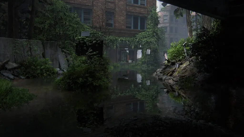
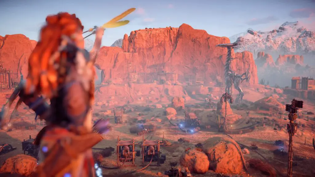
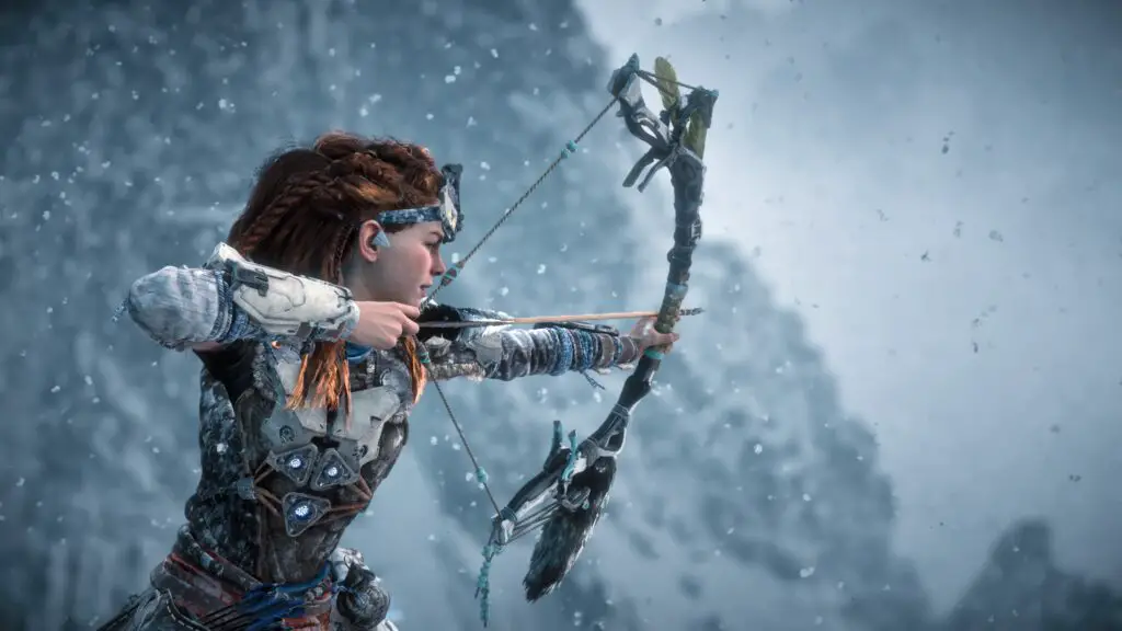
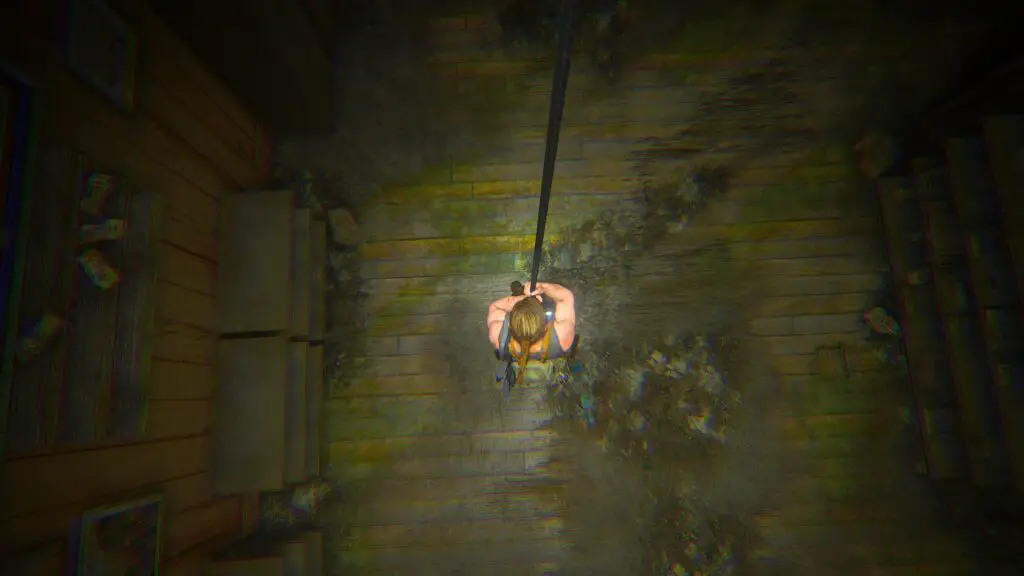
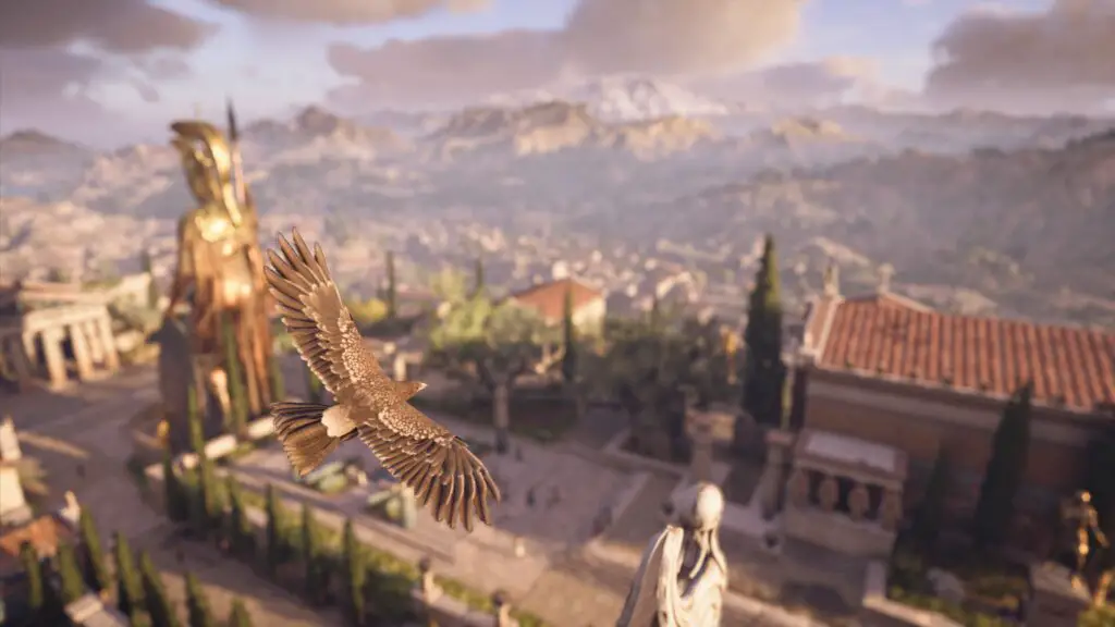
Landscapes and Environments
Rule of Thirds
Many more advanced photo modes give you access to a grid overlay, dividing the screen into thirds. The purpose of this grid is to help you follow the “Rule of Thirds”. A concept used in art of all kinds, that helps to make something look more aesthetic.
With regards to a Landscape photo, this may not always be relevant if your main focus of the photo is just the landscape itself, then there’s nothing to be done here except maybe aligning the horizon with the upper-most third of the image.
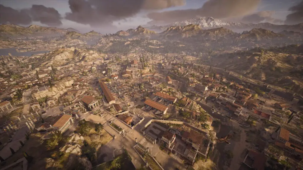
However, if your landscape/environment photo has a key focus point such as a waterfall or a distant tower, you’ll want to try to align that in particular with one of the left- or right-most thirds.
You don’t always want to follow the Rule of Thirds for everything, sometimes it’s better to have your subject centralised, though usually only when there is some symmetry involved and the subject is acting as the dividing line.
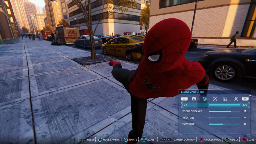
Field of View
FoV, or Field of View, is one of the most common tricks up a photographer’s sleeve. Changing the Field of View will not only widen the scope of what’s visible ahead of you – like an additional zoom control – it will also change perspective slightly to increase or decrease the perceived distance between objects close to the camera and those further away.
So, if you have a character or object in the foreground of your photograph, you could reduce – or “tighten” – the FoV value so that your foreground objects appear closer to the background. Then if you want to reveal more of the landscape or want to exaggerate distances, use a higher value to pull back the FoV more.
Less is More
Often with landscape (I’m going to coin a new term here) Screenshotography you would be taking the photo in order to capture existing beauty in the graphics. So with that in mind, if the landscape was already beautiful or shocking enough to grab your attention, consider whether you really need to change anything about the camera settings other than positioning and angle to get a great screenshot out of it.
You could play with Depth of Field or Filters and Frames, but it could be that by doing that you’re unwittingly and unknowingly taking a worse photo than before. One which you’ll come back to later and think to yourself “Didn’t this look better when I took it?”
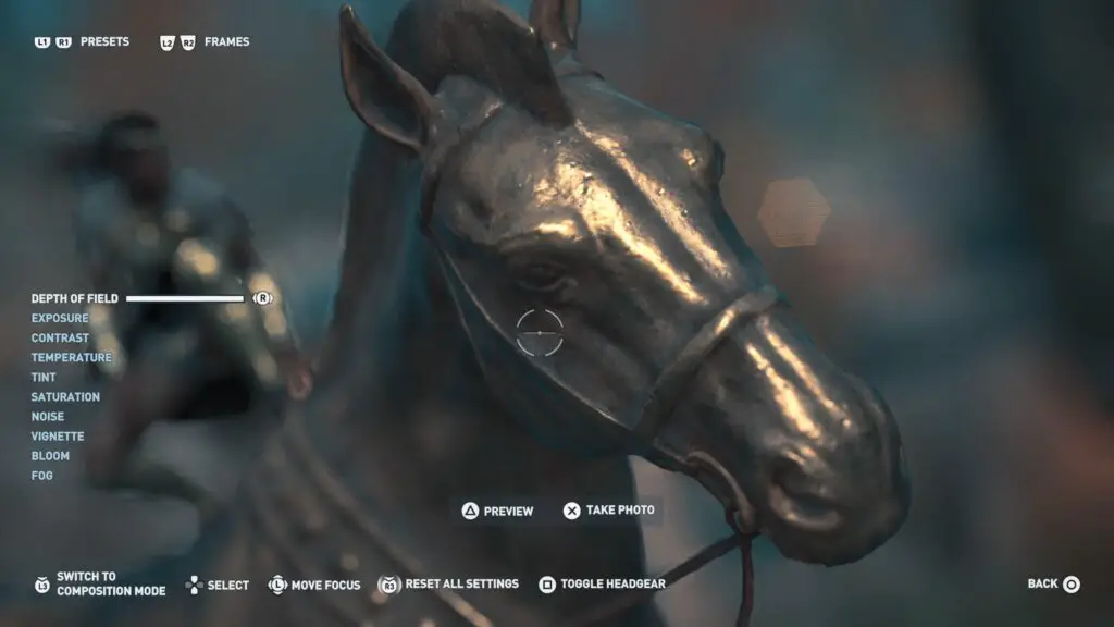
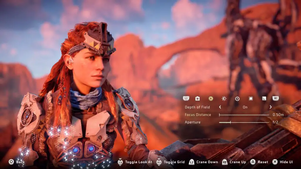
Depth of Field
That said, sometimes there is a time and a place for Depth of Field in landscape or environment Screenshotography.
Usually, having a foreground object such as a vehicle or character helps to give context to the image and provides a nice contrast with better composition. Too much in the foreground, though, can make things look cluttered and you’ll lose the main focus of your image. If it’s a landscape photo, you probably want viewers to focus on the landcape you’re showing them.
In that case, foreground objects are secondary and by blurring them slightly using Depth of Field you can still provide context while keeping the focus where it belongs.
As this is how modern cameras and even the human eye actually work, this technique is very natural and non-intrusive, just remember not to go crazy with the blur, consider what detail you want to be visible before you just move the slider to max and hit Share.
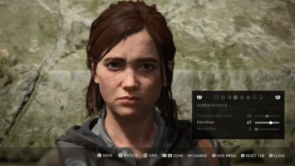
Film Grain
Film grain – also known more simply as “Noise” – is a very neat tool often given to you in more cinematic games as they understand the value that can come from something as simple as film grain.
The thing grain is absolutely best for is hiding imperfections and falsifying detail. Depending on the amount of grain you apply, you’re actually hiding a lot of information from the viewer, whose brain will then fill in the proverbial gaps.
The best case I can make for this is actually with landscape Screenshotography. Most games will place lower-poly or reduced-detail models in the environments to reduce the demand being put on the system. This means that often when you can see a castle or a forest off in the distance, it’s just a 2D plane or extremely low-poly model with a low-quality texture over it.
This isn’t a problem, of course, but when you’re trying to take an image of a landscape to show it off, you also bring attention to it’s flaws. Poor transparency in a treeline or muddy textures can quickly kill the illusion of a beautiful landscape.
Luckily, Film Grain can hide these imperfections. Adding film grain to an image will make sharp lines appear softer and blurred shapes appear sharper, suddenly the common imperfections of game development limitations are eradicated by a very simple trick.
Do note that film grain, or “noise”, is one of the first things to get lost when an image is compressed, and this same compression can cause an image to look a lot worse, so be careful when posting your image to social media that you’re not relying on the effect of the grain too much. Also, note that grain can increase the file-size of an image by quite a lot too.
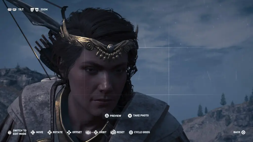
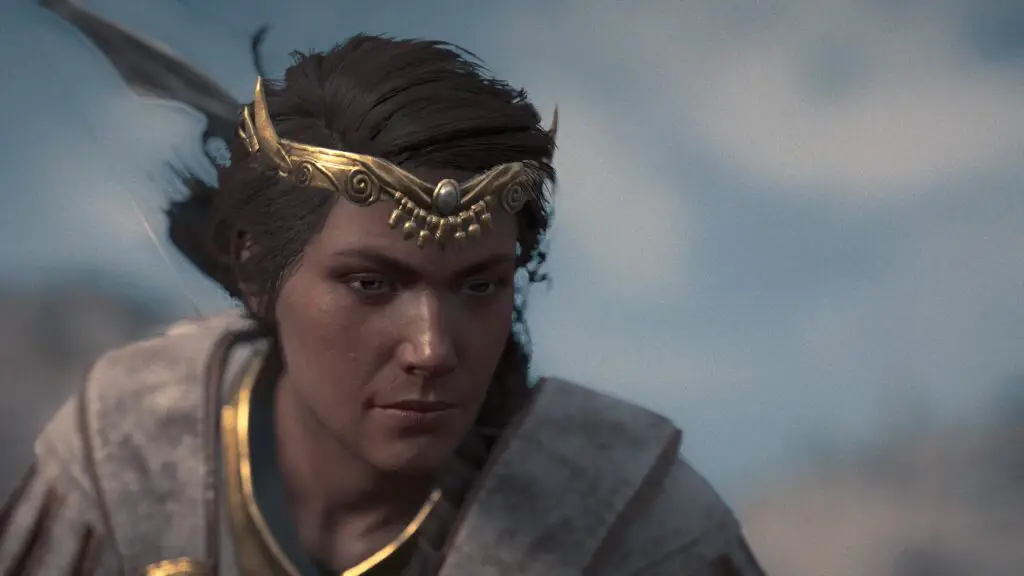
Close-Up and Detailed
Rule of Thirds
The Rule of Thirds makes a comeback, and it won’t be its last. Once again, the handy grid tool which some Photo modes offer allows you to get better and more aesthetic placement on your Screenshotography. Simply ensure that the main focus of your image aligns with one of the outer thirds, doing this will improve the composition of your images and add more style points with minimal effort.
When taking a photo of a character, ensure that if the character is looking to the right, then they are placed on the left – and vice versa. This way the viewer’s eye line is subconsciously drawn into the image rather than away from it.
There are exceptions to this – for example, if the actual focus of the image is a monster creeping up behind the character – but typically viewers feel more drawn to an image if the character is facing, moving toward, or looking at the centre of the image.
Field of View
Field of View helps with Close-Ups in two ways;
Firstly, it acts as a secondary zoom, allowing you to bring the camera in closer than zoom settings will allow – in cases where that’s a problem. If you can get close enough to your object of interest without using Field of View, then obviously don’t.
Secondly, it can help bring the background closer to your subject or indeed push it further away.
Let’s say you want an image of a character’s face. If the setting and the environment is also important, you can increase the Field of View to make more of the background visible. If the setting and the environment holds no bearing on the image, then you can simply bring it in with a lower value to ensure there are less visible distractions in the background, which is also where Depth of Field will come in…
Depth of Field
Depth of Field will be crucial to a lot of close-up shots. With Depth of Field you have the ultimate control over what the focus of your image is. If it’s a portrait image and you want to make sure that the only thing the viewer will care about is the character you’re screenshotting, then you can use depth of field to completely blur out the background.
The same goes for close-ups on small objects of interest. If there’s a cool creature in a forest, the busy setting of a forest could be drowning the focus out, making the creature harder to see at first glance, or more difficult to appreciate. Using Depth of Field to blur out the insignificant detail of surrounding objects helps to bring out the beauty in your subject matter.
Film Grain
This is for the same reason as for Landscape Screenshotography. With close-ups you open yourself up to many issues with low-poly models or low-quality textures and adding a simple Film Grain can falsify detail in the image and mask imperfections.
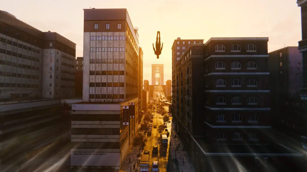
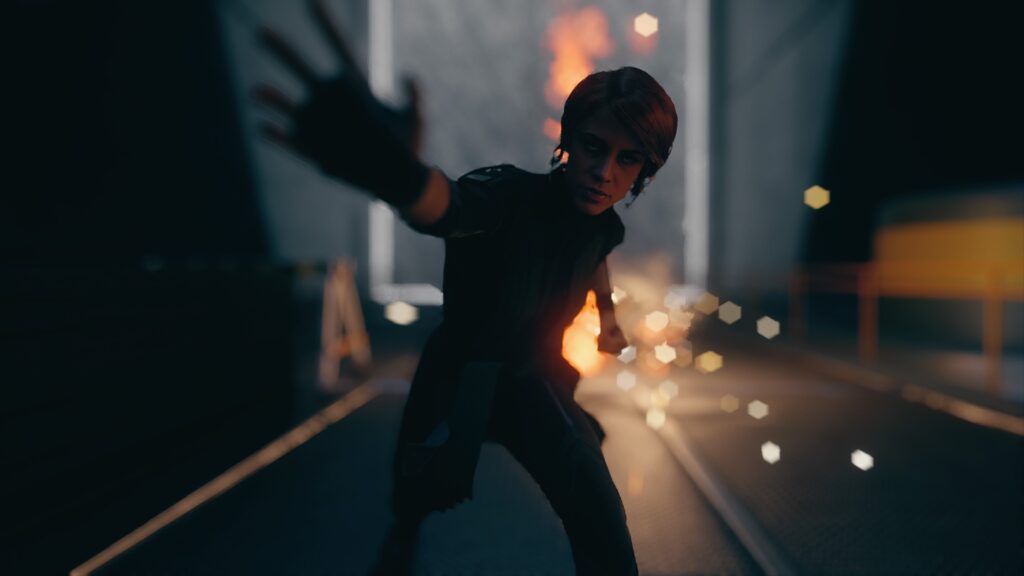
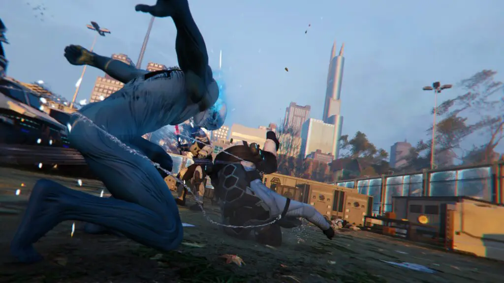
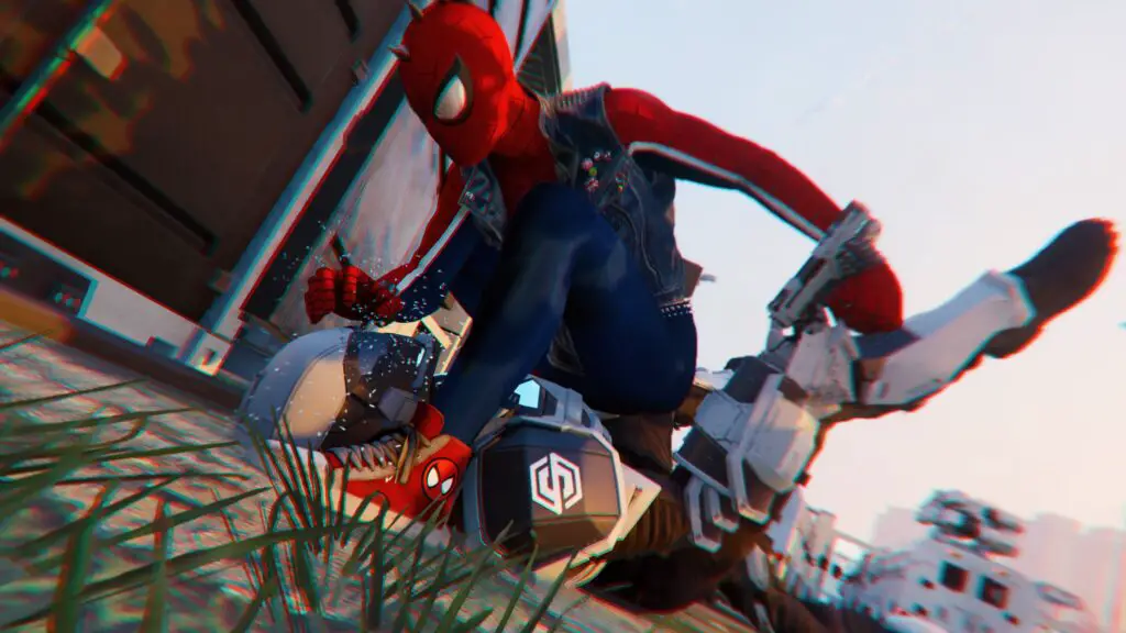
Action and Motion
Rule of Thirds
As I was saying before about the Rule of Thirds; it’s important that the viewer’s attention is brought into the image, rather than away from it.
So, if you have a character in the left-most third of the view and they’re attacking someone off the left side of the screen, then your viewer’s eye is immediately driven straight out of the image.
Instead, you want whatever action is visible in the scene to be moving from one third to the opposite third or the centre of the image.
Field of View
The best case for the use of FoV settings in action shots is anime. Think about how in certain anime scenes, a character will draw their arm or weapon back in preparation of an attack and their arm will seem heavily elongated, almost like rubber. It adds more dynamism to the scene and a visual cue of the power behind the attack.
Achieving that “Foreshortening” effect in real life without breaking any bones is very difficult, but FoV is the way to go.
Remember how I said that it increases the distance between your subject matter and the background or foreground of the image?
Well, if a character is the subject and their fist is a foreground object, then by increasing the FoV you’re increasing the distance between them and their fist, thus adding more movement and power to the attack you’re capturing.
Camera Roll/Tilt
Camera roll isn’t a totally necessary feature and will mostly be used to ensure your scene fits within the frame correctly or for taking your new mobile wallpaper, but it has real application in Action Screenshotography.

Say you have a character who is on the left and is attacking something on the right with a downward sword-swing or hulk-smash type attack, rolling the camera can make it seem as though that attack hit so hard it has actually tilted the ground – or the whole world – away from the level axis of the camera’s field of view.
Depth of Field
Depth of Field really isn’t important for action shots, in-fact using it can actually be detrimental and result in you losing the momentum and dynamism the image started with.
However, in some cases you will find that you have a very cool action shot which is drowned out by the busy nature of the background. In this case you would want to use DoF to bring some of that focus back onto your main subject matter, but keep the effect as subtle as you can.
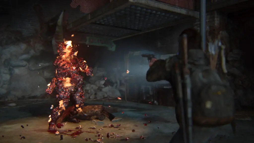
Chromatic Aberration
Chromatic Aberration is a strange effect which is cropping up more and more lately. It’s sort of like an edge blur but it works by splitting the red colour channel away from the blue and green colour channels.
This has multiple uses, often more than just making your photo look cooler or “more sci-fi”.
In my experience, there are three best use cases for this effect;
Simulating disorientation
If a character took a big punch to the face and you captured that in screenshot form, you could use chromatic aberration to simulate the discombobulation they’d be feeling from that.
Or, you could use it to infer the feeling of Vertigo. If you’re looking down over a cliff edge, you can pull back on the FoV to make the distance seem greater and then throw in a touch of chromatic aberration to simulate the nauseating feeling of vertigo which some people would experience at that height.
Simulating Speed
Unless I’m stupid and/or mistaken, the idea of chromatic aberration comes from the concept of travelling at – or near – the speed of light. At that speed, the wavelength of light is stretched out and each colour down the spectrum reaches the eye at different speeds, with red being last. This is also known as Redshift.
Thus, if you have a shot of a vehicle or other object moving at high speeds, Chromatic Aberration can be used to exacerbate the speed at which they’re moving. Again, you can use Field of View to further exaggerate the speed.
Emphasising Impact
Explosions, punches, crashes, demolitions, whatever it is – if it makes a loud noise and is generally explosive or implosive, then chromatic aberration will help you to further exaggerate that impact because it looks as though a powerful shock-wave has just hit or passed the camera.
Just For Fun
Filters & Effects
Filters can really help to change the lighting, colours or tone of your shot. If you have a pretty sinister-looking scene you can throw on an infrared filter which makes the whole image red and much more menacing. Or you can use filters to exacerbate light sources and make them really stand out.
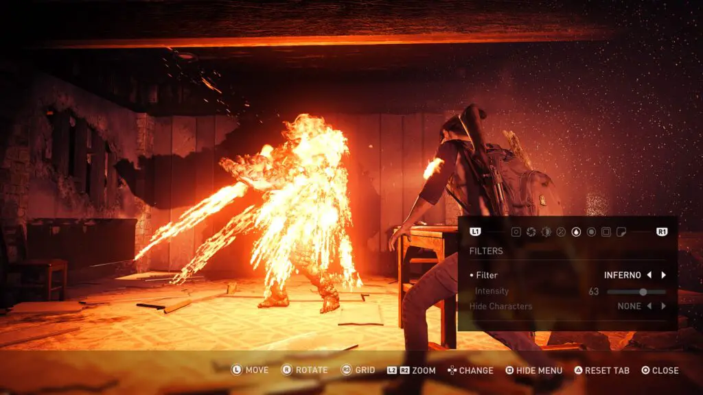
Or, say you’re taking photos in-game but it’s night. By adjusting the exposure and brightness, then playing with colour filters you can in some cases make it actually look like it’s daytime instead.
Really there’s very little advice to give when it comes to Filters as they’re very situational and it really depends on what you’re taking a screenshot of. I’d recommend you play with them as much as you can to get a feel for what works best for you, but if you’re not sure then it’s probably better to not use a filter.
If a scene was cool enough for you to want to take a photo then you probably don’t need any filters at all. Don’t feel like you have to use them just because they’re there. Over-use of filters is what ruins most people’s screenshots and knowing when to refrain will make you a much better Screenshotographer.
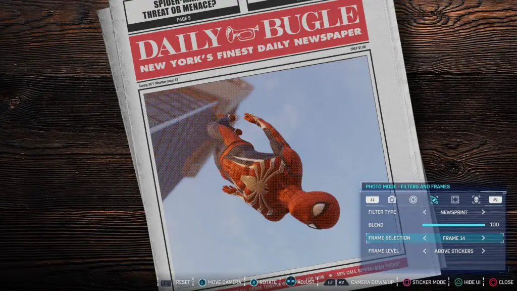
Frames
Frames are really just for fun. Sometimes it is just the game’s logo, allowing you to make your own posters for the game, which can be a fun little thing to try.
Sometimes the frames help you see the image in different aspect ratios such as 1:1 square for Instagram or a superwide cinema-screen ratio to help your shot look more cinematic.
Lastly, they’re often just for fun. Things like billboards, magazine covers, literally art frames. Go wild with these as much as you like, but take my advice and always capture the image without the frame too. You never know when you might want it for something else, or regret adding the frame when you look again later.
Extra Info
Here are just some helpful hints and tips to help you out with specific controls and terminology.
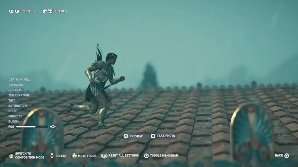
Depth of Field Explained
Depth of Field is sometimes just a toggle and you’ll be given two controls called “Focus Distance” and “Aperture” (or something similar). Some photo modes also have a “Blur Amount” option, but let’s assume there isn’t one.
Focus distance is literally the distance from the camera to your point of focus. So, say for example if you have your character 200ft away from the camera, then you’d change your focus distance to 200ft. This likely won’t be an accurately measured distance scale and rather just a slider with a maximum and minimum value, though it should be fairly obvious where the focus point is just from looking at the screen as you change the value.
Aperture is the big daddy of DoF controls. The Aperture value will affect the size of your focus point and also (unless there is a separate “Blur Amount” setting which will handle this) the strength of the blur effect.

Having a very low aperture will mean that only objects within a few feet either side of your focus distance will be in focus and not at all blurry. As we head further out from the focus point indicated by focus distance, the objects become more and more blurry.
Having a very high aperture will mean that the distance from the focus point that objects will be visible is much greater and it also means that the fade from sharp to blurred as you head further out is a much longer and smoother transition.
Saving your HDR screenshots
HDR is an incredible feat of visual technology and allows us to enjoy games with stunning visual contrast and mind-blowing colour, but often you’ll find that when you save those stunning visuals in screenshot format from your PS4 Pro they’re much too dark to see, especially in darker areas.
To get around this, you can usually adjust the brightness and exposure controls in a photo mode. Bumping up the exposure in particular will really help bring out the details in your images – but can also result in extremely bright and burnt-out whites.
It changes with every game and each person’s individual HDR settings and preferences, so it will help to play around a bit and maybe take some practice screenshots first so you have an understanding of what to expect and how best to improve the images. As a universal solution, however, I’ve found that 90% of the time bumping up the exposure by 2 notches and then bringing the brightness down (or contrast up) about 5% helps most dark images regain some of their quality.
Once you’ve mastered the above and are taking fantastic screenshots which you’re already planning to put on your annual Christmas cards to the whole neighbourhood, why not use the 1, 2, Switcheroo method to ensure your trophy screenshots are looking just as incredible when you share them on social or r/trophies.
Speaking of which, if you take any photos you’re proud of with the above method, tweet them @GetPlat or tag us in a share on insta @platget and we’ll take look! Very excited to see what incredible screenshots people capture!
Edit: I just found this fantastic guy on Twitter who posts some really excellent photo mode advice, check his tweets out to build on what you learnt here with advice from a professional Screenshotographer!